UX Writing , Design Audit
Website Redesign
Driving company growth by updating company website to boost user experience, align with brand goals, enhances SEO, and accurately showcase product features.
Problem Statement
The current content on our company website is outdated and inaccurate, which can lead to confusion and mistrust by clients. Rewrite and refresh the content to accurately reflect our offerings, enhance user understanding, and improve overall engagement.
Role
UX Writer
Client
Internal
Methods
UX Audit
User Personas
Project Overview
As part of an initiative that I started, we decided to redesign our public facing website. The content was outdated, did not accurately represent our offerings, and did not align with our brand. This project focused on rewriting and refreshing the website content to clearly showcase our key features and offerings to utilize our company website as a place for users to access helpful tools and resources,


Research
In order to determine changes that needed to be made or the direction we wanted to go with the new site, I first wanted to know who our audience would be.
Similar to a straight B2B product, the end users are usually different than the buyer. We were targeting a few very specific audiences.
Aside from the potential buyers, it became clear to our team that we also needed to target our potential employees. The website is a first impression of who we are as a company and the standards and expectations we hold ourselves to.
Analysis
By creating user personas we were able to determine a range of personalities that would potentially view our site. I was able to base personas off of my personal interaction with users as well as interview the client services team to gain additional insight. From here we were able to determine what needed to be communicated through our site and the information that would be essential to include in order to accurately describe our product and how it could meet the needs of the users.


Audit
After gathering data from our User Personas, I took a look at our current site and was able to pinpoint what elements we were missing, could be improved, or transferred over to our new site.

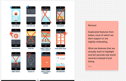

Brainstorming
What solutions do we offer?
I put together a list of features, client types, and scenarios to show how our platform can meet the needs of employers for their employees. By looking at different workplaces and client types, I highlighted practical ways our solution can make a difference. This helps employers see how our features can boost employee satisfaction and productivity.

Mock-ups
I was given a mock-up design file were I added copy to be used that encouraged navigation through the site access to information that would educate users about our product, how it could fit their needs and who to contact for next steps.
*My notes in periwinkle below
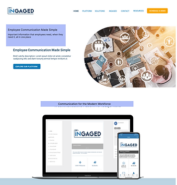

Published!
The developer on our team was involved in the process as a voice for what elements were achievable in our timeframe and which pieces needed to be modified for the time being. We went through a series of design and content editing and finalized our concept. Once our design was finalized, we passed everything off to the development team for build.
What I would change
Looking back there are a few changes I would suggest be made.
Representation
An important note here was that the current site only pictures people in an office setting. After communicating with the client team and looking through our client base, it became very clear that a majority of our end users do not work in an office setting. Our client base includes grocery store chains, restaurants, construction companies, healthcare facilities. When buyers are coming to our site it would be easier for them to envision their team using our product if they were being represented on our site.
UI Updates
Once the designs went from mock up to development there were several areas that got a bit lost in translation and should be improved on the published site including spacing, there were several pages that include placeholder icons ect.